
Google Updates Icons for Messages, Phone, and Contacts Apps with Sleeker Design
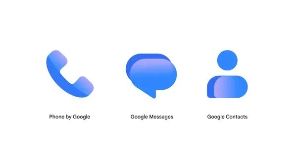
Image: Google · Source
Google has refreshed the icons for its Messages, Phone by Google, and Google Contacts apps, introducing a sharper and more cohesive design while maintaining existing app functionality.
On November 2, 2026, Google announced an update to the icons of three widely used communication apps: Messages, Phone by Google, and Google Contacts. While the core functionality of these apps remains unchanged, the new icons present a refined visual identity that reflects user feedback and aligns with Google's broader brand aesthetic.
The redesigned icons feature subtle but crisp gradients and clearer edges, enhancing their appearance on various display types. The curvature and coloring of the icons have been updated to more closely match the design language of other Google applications, including the core Google logo, which helps create a more unified look across Google’s app ecosystem.
Google's update specifically aims to improve the clarity and sharpness of the icons on users’ home screens without altering the apps’ operation or interface. This update will roll out gradually over the coming weeks, ensuring users see a more polished and cohesive icon set for these essential communication tools.
Users interested in the update and its design process can engage further via Google's community forum, where conversations around the icon changes and user feedback continue. These enhancements are part of Google's broader efforts to refine user experience through subtle yet meaningful design adjustments across its platform offerings.
Sources and original reporting
Read the original source ↗
Comments (0)
No comments yet. Start the discussion.
Write a comment
Comments are published after moderation. Your name and comment will be visible publicly. Account